TOFUKOMA operates as a distributed intelligence—not a division of labor, but a shared cognitive field in which Margarita Köhl and David Altweger function as distinct yet entangled processors.
Rather than merging perspectives into consensus, tofukoma thrives on productive asymmetry. Intelligence is distributed across sensibilities, temporalities, and modes of attention.
Design Perspectives,
Methods and Frameworks
Its divisibility allows for proportional layouts like halves, thirds, and quarters, making it adaptable for various sizes. It acts as a bridge between print and digital—rooted in the structure of print but perfectly suited for responsive web layouts.
Fachbereich
Gestaltung
Gestaltung
MA Design and
Creative Leadership
Creative Leadership
20
26
26
TofukomaT
Ein Raumfür Erfahrung, Intervention und kulturelles Lernen
tofukoma exists between Margarita and David, not above them.
Intelligence emerges in the feedback loops:critique ↔ constructionintuition ↔ systemhesitation ↔ executionDecisions are rarely binary; they are phased. Ideas pass back and forth, accumulating resolution through iteration.
Authorship is deliberately blurred—not as a gesture, but as a necessity: no component alone can produce the outcome.The studio thinks in parallel. Disagreement is not a failure state but a signal that the system is alive.
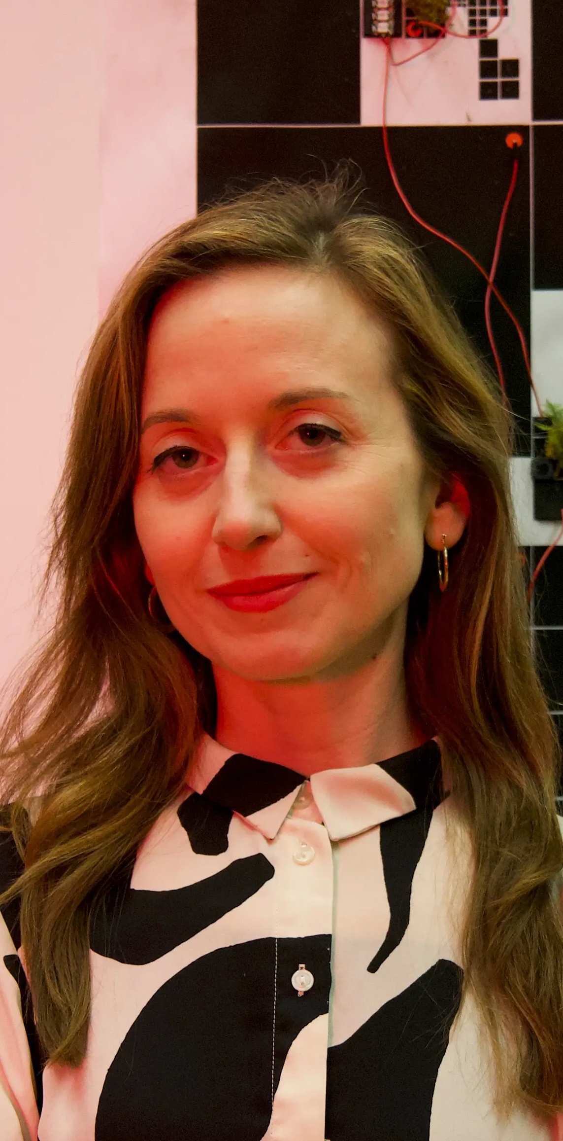
Margarita Köhl — Attunement, Friction, Sense-MakingMargarita acts as a sensorial and critical node within the system. Her intelligence is oriented toward perception, material sensitivity, and conceptual precision. She detects frictions early—where ideas resist form, where aesthetics overperform meaning, where systems reveal latent politics.Her role is not refinement for elegance, but calibration:slowing processes to expose assumptionstranslating affect, intuition, and ambiguity into articulable stakesensuring that works remain porous to context, bodies, and lived experienceShe introduces ethical latency into the system—moments where speed is suspended so responsibility can enter.
E
Hybrid Systems Lab
Hybrid Systems Lab
Kunst
Forschung
Design
Lehre

